More projects
Let's connect
Get in touch for opportunities or just to say hi!


More works? Please visit
my old website here
E-commerce Platform
Hspace Kitchen and Bath
Your one-stop-shop for premium quality kitchen supply.

Overview
Hspace is a comprehensive platform offering high-quality kitchen supplies, enabling customers to design their dream kitchens or hire professional designers. It also functions as a marketplace for qualified designers, facilitating connections between them and customers after a thorough platform review. Hspace features a customer-facing front-end and a staff-specific back-end with varied access levels.
Role
UX and UI Designer, Project Manager, Marketer
Product Strategy, User Research, Interaction, Visual design, Prototyping & Testing, Marketing
Project Time
Dec. 2020 - Oct. 2023
User Research
The problem
As a customer who has done a lot of online shopping for home goods during the pandemic, I find that the old website of WoodWorth does not meet the needs of presenting and selling cabinetry goods to end-users. There are four major problems:
There is a lack of processes for purchasing products and inadequate customer services, such as planning and warranty services.
When customers try to assemble the Cabinetry product themselves, there is no clear assembly instructions.
As a customer, it is challenging to visualize how the final products will look in their kitchen due to a lack of detailed product information.
The old design style fails to represent the simplicity and high quality, which are essential aspects of the new cabinetry system upgrade.
I initiated the user research by conducting interviews and the research explored user experiences with the current Woodworth website and other platforms, including IKEA and Wayfair. I believe one on one interview method allows for a deeper understanding of the users. It enables the observation of reactions during the testing of feature functionality, for instance, observing how they utilize the IKEA home planner.
Selected quotes
Background
During the pandemic, numerous traditional Canadian companies faced the challenge of lacking means to sell their products. Woodworth Cabinetry, one of the largest Canadian cabinetry manufacturers with a 40-year history, had primarily served dealers (B2B). However, in 2020, due to the closure of many dealer stores, the company recognized that their existing website was unsuitable for showcasing and selling products online. Consequently, they identified an urgent need to develop a new, and professional website to transition towards a B2C business model.
I was the whole design and half of the marketing team.
This was a freelance project that I undertook outside of work hours, dedicating a significant amount of my spare time and weekends to work closely with the founder. Not only did I design the website, but I also helped shape the brand identity, including the new logo, business cards, and brochures. Additionally, I took on the task of photographing the products and building the brand's presence on social media.
User Insight and Problem Statement
User Insight:
Canadians are increasingly shopping online for furniture and home accessories, especially during COVID-19. While many prefer platforms like Ikea, Wayfair, Structube, CB2, and local stores, these big-brand sites have limitations. User interviews revealed various challenges: complex planner tools, insufficient material information, warranty queries, complex assembly instructions, excessive building parts, aggressive sales tactics, unclear inventory, and costly delivery options.
Problem statement:
As a result of the pandemic, shopping online for furnishings, such as cabinetry, has become the new normal. Safety concerns have created the need for self-assemble kitchen cabinetry to meet the ever-changing demands of online shopping habits.
A new website for Woodworth Cabinetry featuring a home planning tool would offer users an easy shopping process, accurate inventory information, clear online assembly instructions, and a user-friendly home planning tool.
User personas and User Journey
Drawing on the insights gathered from the interviews, I develop a user persona that encapsulates the typical characteristics, needs, and motivations of our target audience. Additionally, I proceed to map out the user journey.
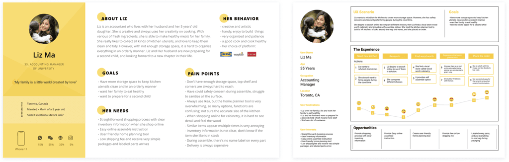
After collecting the recordings from the user interviews, I conducted affinity mapping to synthesize the identified pains. I grouped these problems under common themes and features within the platform.


Feature prioritization matrix
Based on the research, I aim to identify the most critical problems that need to be addressed first. This involves aligning solutions with both user and business needs and developing an initial feature prioritization matrix.


Site map
Matrix
Designs in 2020
From december 2020, one of the key features is the design center. This tool consists of a 6-step process that allows clients to design their dream kitchen online. From earlier research, it was found that customers feel the IKEA design tool is too complicated to use, so I aimed to make the interface as simple as possible to avoid confusion for the users. At each step, there are instructions, and users can use the mouse to draw shapes. Due to the need for a larger screen for operation, this feature is available for desktop use only.
Selected Steps 2, 3, 5, and 6 of Design Center

Iterations in 2022
From 2021 to 2022, with the effort of the website, online sales dramatically increased by 135%, enabling Woodworth Cabinetry to open 3 new branches in the United States. Consequently, the company decided to expand its product range. Instead of solely selling kitchen cabinetry, they now offer a variety of products including furniture, home office, countertops, kitchen supplies, lighting, flooring, etc. The goal is to transform into an international manufacturer similar to IKEA.
To align with this purpose, the website underwent several major changes, one of which is the navigation bar. The previous dropdown menu was replaced in 2022 with a new design that moves the logo to the top and incorporates icons into the secondary menu. This is a strategic design choice that aligns with the brand’s commitment to simplicity and intuitiveness. The icons are utilized for three main reasons: visual clarity, international accessibility, and enhanced user experience.
The Hspace project is a case to which I have dedicated a lot of effort over the past 3 years, and I continue to work closely with the marketing team on advertising. This involves creating social media materials, reports, annual brochures, and other promotional content. I am extremely proud to be part of the team and to witness the business's growth. I wish it a bright future.
Reflection
Competitive Analysis


Visual Design and Images
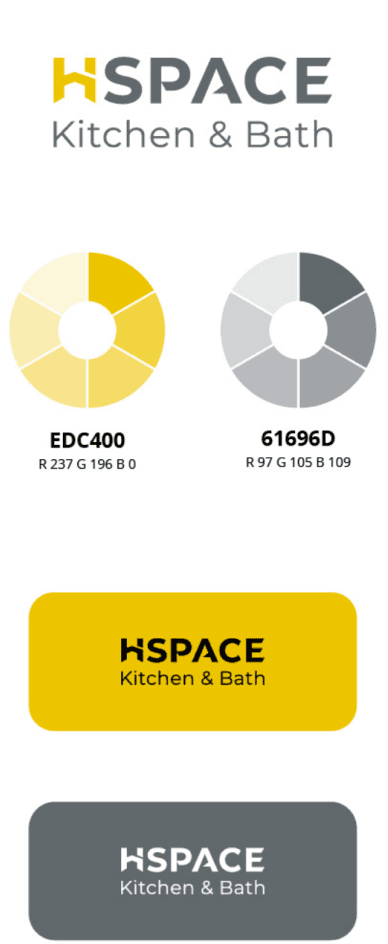
Visual design begins with creating a new brand name. I collaborated with stakeholders to figure out the name, and create four different versions of logos with color choices. The best fit is a simple, modern style logo that matches their presentation.
Due to the limitations on real photo shoots during Covid, I worked with a digital compositor to design, model, and render a series of 3D kitchen images, resulting in the following outcomes.
Chosen Logo


Irritations from 2023

Some 3D Render Image with Maya

