Problem statement:
Customers are facing difficulties in understanding and navigating the existing rewards program because of a complicated interface and too much information on the website. Seniors struggle to navigate and utilize it, whereas younger customers seek a straightforward method to rapidly earn and redeem points. The website should simplify the process for all customers to maximize their rewards effortlessly and without confusion.
Defining the problem statement: After gathering the findings from the research, I worked with the team to define the problem statement.
Scotiabank
Scene+ Program
Empower 9 million customers to earn points on everything.

Overview
Starting December 13, 2021, SCENE and Scotia Rewards became Scene+, a new rewards program. Members can now earn and use points in more ways, including travel and shopping. Scotiabank also released 8 new cards for earning points. The main focus is on updating the Scene+ design on the Scotiabank website.
Role
Product Designer
User Research, Interaction, Visual design, Prototyping & Testing
Project Time
April 2022 - Nov. 2022
Background
Scotiabank is a leading international bank headquartered in Canada, dedicated to helping its customers, communities, and businesses prosper through a broad range of personal, commercial, corporate, and investment banking services.
I was the sole product designer of the Scene+ team.
I was the sole designer on the team alongside project manager, journey manager, graphic designer, content writer, QAs, business analyst and the engineers. I was responsible for the product design and UX/UI experience and I've been extremely fortunate to have part of this journey for helping 9 million customers.
Consumer Insights
Understand the problem
As a Scotiabank user who travels often, I know how great it is to get travel points from what I spend to save for future trips. Hence, I started by looking with a personal insight into my banking needs and conducted a competitive analysis of familiar loyalty rewards programs, such as CIBC's Aeroplan and RBC's Petro-Points.
Competitive Analysis
There are some overall insight for competitor analysis:
Competitor landing pages tend to be text-heavy and potentially overwhelming for users.
Canadian Tire Bank, BMO, TD, and CIBC lack dedicated landing pages for rewards programs.
Information on rewards programs is typically found within the credit card sections of these competitors' websites.
Most competitor sites do not feature regional targeting for users.
A select few competitors utilize interactive maps to help users find the closest locations.
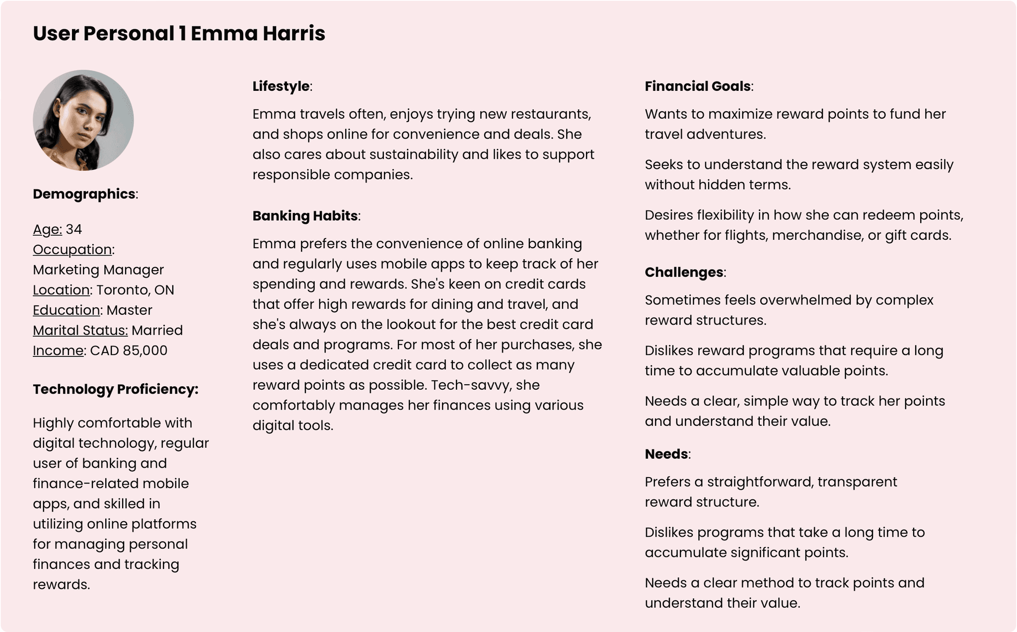
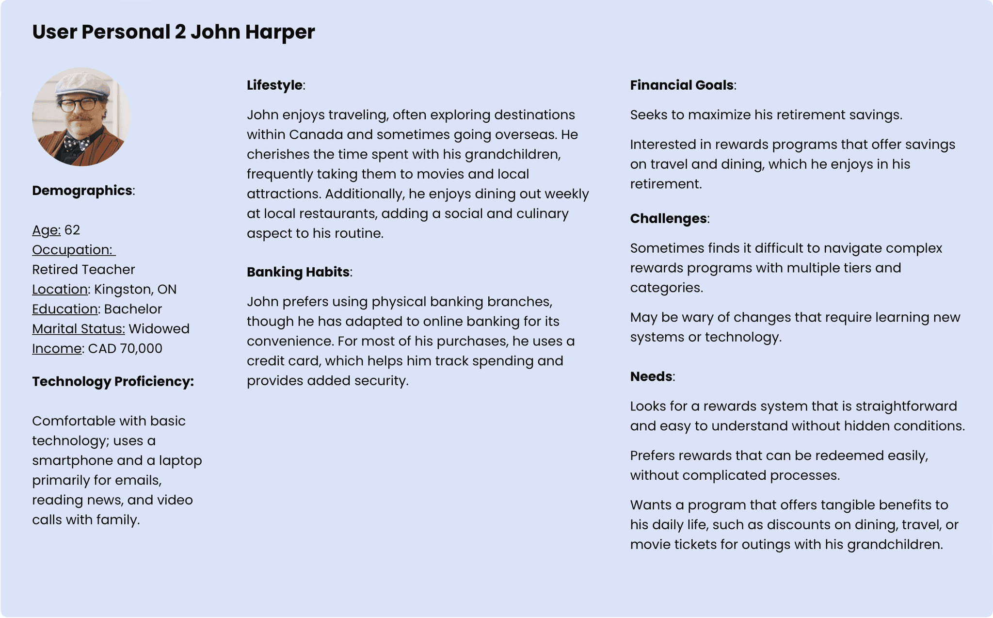
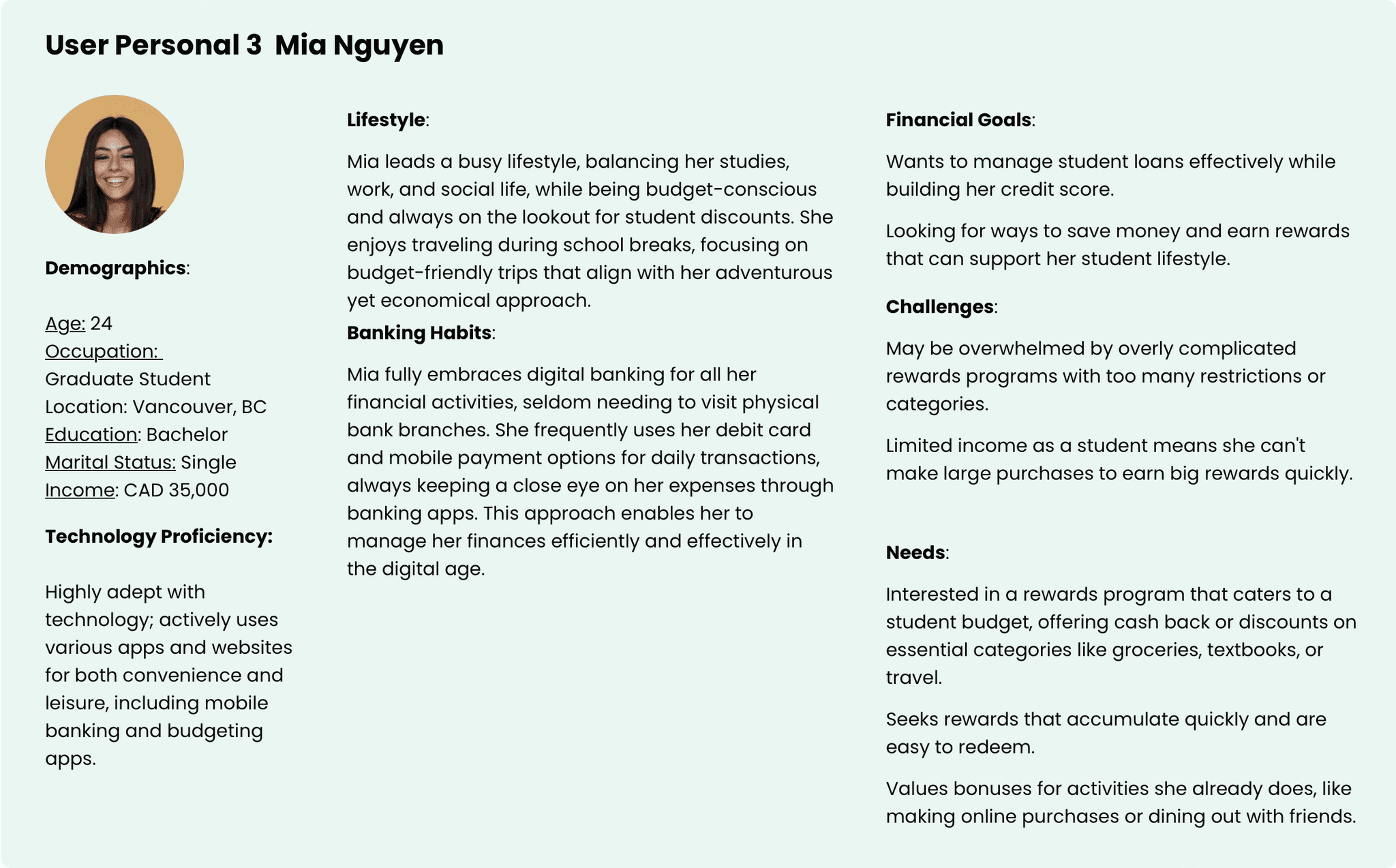
User personas
Considering the diverse types of users for the banking app, we've opted to focus on three key demographic groups based on their age and employment status: middle-aged individuals, seniors, and young adults.
Persona Summery
Based on insights gathered from individuals across three age groups, I have identified several common needs and challenges:
All age groups express interest in having a reward system that allows them to earn rewards to support their savings goals.
They find structured reward programs with excessive restrictions to be overwhelming.
Each age group prefers rewards that are easy to redeem without a complicated process.
They are all keen on benefiting from discounts or earning bonuses.
Older generations tend to encounter more difficulty in adapting to new technologies compared to younger generations.
Insight 1
Reward my habits
Stores I shop at for everyday items (grocery, pharmacy, gas)
Insight 2
Easy to accumulate points
A wider variety of places to earn points; in person and online, bonus points events.
Insight 3
Easy to redeem points
Quick/easy POS redemption, seamless online systems, available at more retailers.
Insight 4
Flexibility: cash in/save up
Able to redeem points as I please.
Insight 5
Don’t dash my hope with restrictions
No rules or regulations that limit my ability to use points in ways that benefit my needs.
The product vision and solution
As a product, our goal is to establish ourselves as a reliable platform affiliated with a trusted bank, with a focus on three key areas:
Designs and challenges
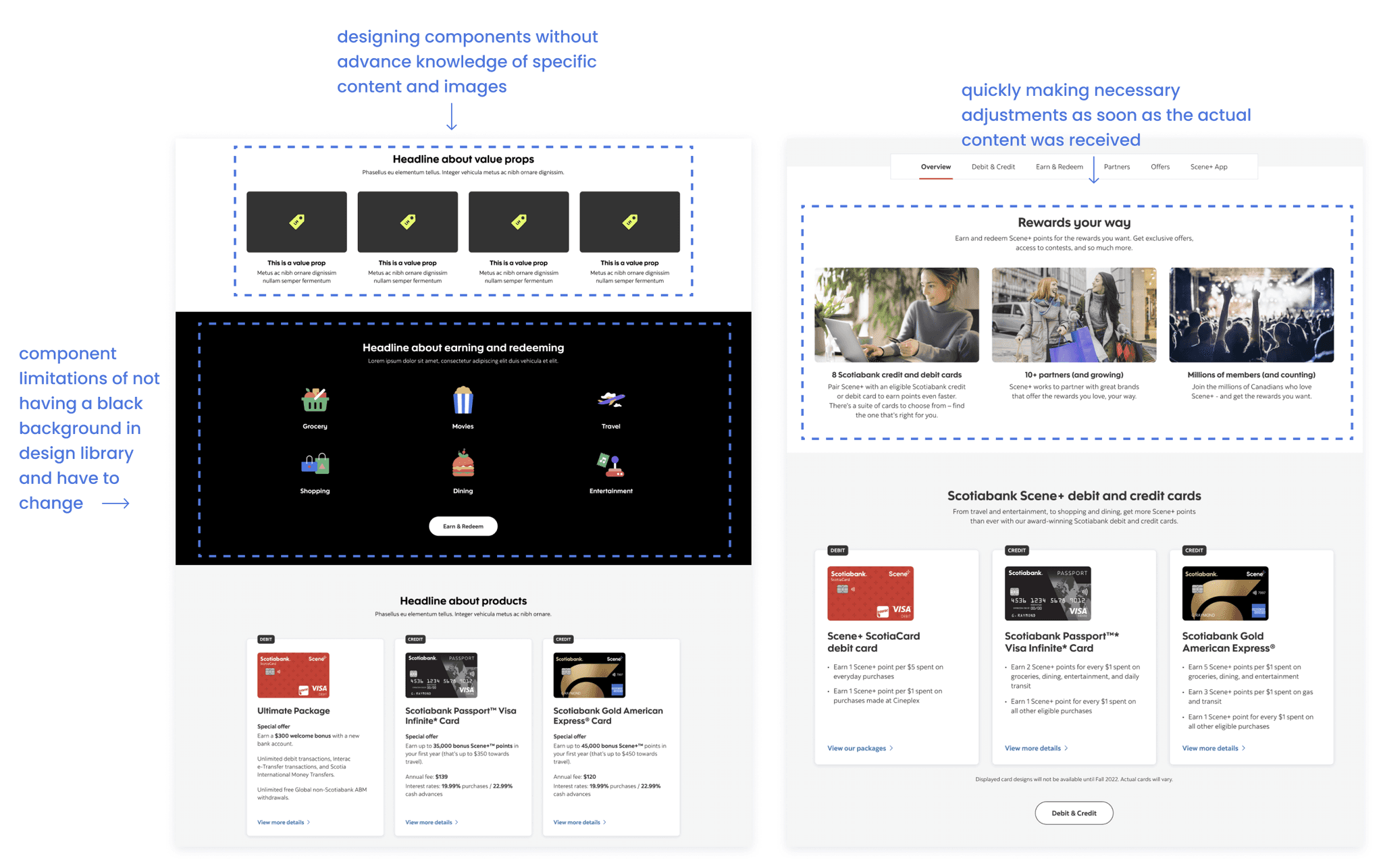
In the initial six versions, I collaborated closely with content managers, project managers, and business analysts to explore various creative possibilities and comprehend the constraints of the existing components. This process presented multiple challenges. For example, adapting the design to align with component limitations necessitated several iterations to achieve a balance between the design and development aspects. Additionally, designing image components without advance knowledge of specific content and images was challenging. I based my preliminary designs on educated guesses informed by prior UX research, quickly making necessary adjustments as soon as the actual content was received
Focus 1
Integrating the two brands seamlessly on Scotiabank's homepage to emphasize the enhanced Scene+ program.
Focus 2
Develop a clear and visually appealing guide to assist all age group customers in easily earning Scene+ points.
Focus 3
Ensuring customers are aware of the 8 new Scotiabank Scene+ cards that enable them to accumulate points more rapidly.
Version 3 VS 4 with Scotiabank Cards
Iterations
In the latest 9 updates, from versions 7 to 16, I've added new features and made several improvements. A key challenge was the design of a table to integrate card products with their earn-and-redeem points systems effectively. Considering the heavy usage of mobile apps by many customers, the original table's content-heavy layout posed usability issues. To resolve this, I streamlined the information, guiding users through steps that combine the reward system with card features. For the mobile version, I designed an interface where users can horizontally scroll through three card options and vertically to see more details about each card.
Version 12 VS 16 with with Reward table
Working with QAs and developers
Maintaining clear and consistent communication is crucial. To achieve this, I arranged meetings with the two Quality Assurance (QA) team members involved in the program. During these sessions, I shared various documents, including user flow diagrams and interactive prototypes, and conducted screen sharing to explain the designs comprehensively. Recognizing that one of the QAs was new to the bank, I made efforts to provide as much information as possible to ensure a thorough understanding of the intended user experience.
Upon collaborating with the developers, I encountered some challenges stemming from component limitations. For instance, the component library lacked a black color option for backgrounds, leading to a compromise with a dark grey background. However, in version 16, I successfully persuaded the developers to adopt my design approach, which involved merging information with card features and the earn-redeem point system. Although this concept was not part of the existing design library, it was deemed desirable. As a result, the final design underwent slight alterations, such as changing the choice section from a horizontal menu to a dropdown format, which was ultimately acceptable. Once the developers have constructed the product, I conduct thorough testing to ensure it operates smoothly and is free of errors.
Results and takeaways
Our team successfully implemented 75% of my designs for our users, and I'm proud to have contributed to this extensive project. Some key lessons I learned include:
Balancing Design and Technical Constraints: I needed to balance aesthetic appeal with the existing components in the design library to ensure technical feasibility.
User-Centric Design is Crucial: Considering the diverse demographics of the bank's clients, it was essential to tailor the design to meet the varied needs of all users. This included making the interface simple and easy for everyone, from seniors and young adults to users with disabilities.
Iterating for Perfection: Continuously testing and refining the designs after every iteration was crucial for improvement.
Effective Collaboration Across Teams: Close collaboration with other teams underscored the importance of cross-functional teamwork in UX design. Clear and timely communication was key to achieving the final product.
Let's connect
Get in touch for opportunities or just to say hi!


More works? Please visit
my old website here