

Let's connect
Get in touch for opportunities or just to say hi!


More works? Please visit
my old website here
Schneiders’ Food
Brand Redesign
New look of the national food brand for over 100 years.

Overview
Schneiders embarked on a complete website redesign with the ambition of remaining Canada's leading meat manufacturer. The aim of this project was to refresh the national brand's appearance and align it with the latest campaigns.
Role
UI and UX Designer
Market Strategy, Research, Interaction, UI guide
Prototyping & Testing
Project Time
Dec. 2021 - Feb. 2023
Background
Schneiders, a Canadian national brand founded in the 1890s, possesses a century-old legacy. Its website, outdated by two decades, required a fresh, modern update to reflect the contemporary vision of Schneiders.ca and enhance the user experience for its customers.
When I joined the project, I worked closely with Project Manager Katherine. Drawing insights from the existing research reports, we identified the following requirements as specified by the stakeholders:
Needs
The redesign needed to mirror the brand's updated, sophisticated, and maximalist aesthetic. The objective was to craft a visual style that underscores Schneiders' core values of Taste, Craftsmanship, and Authenticity.
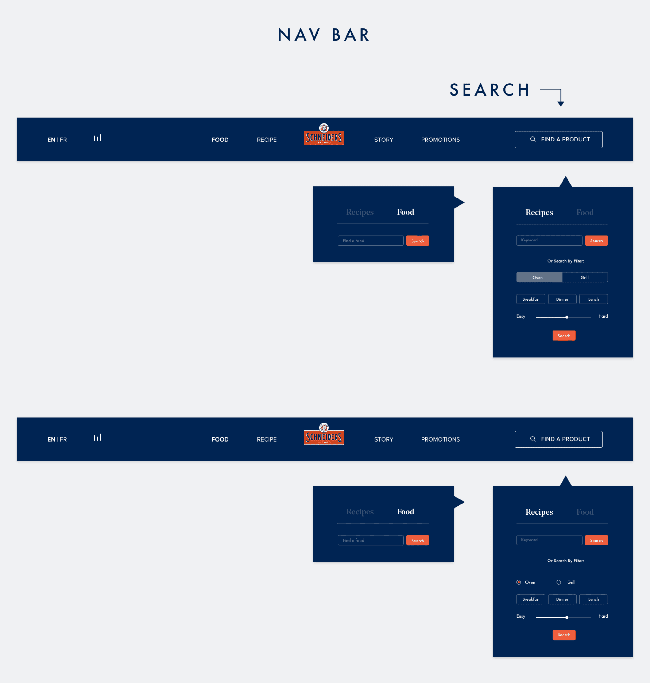
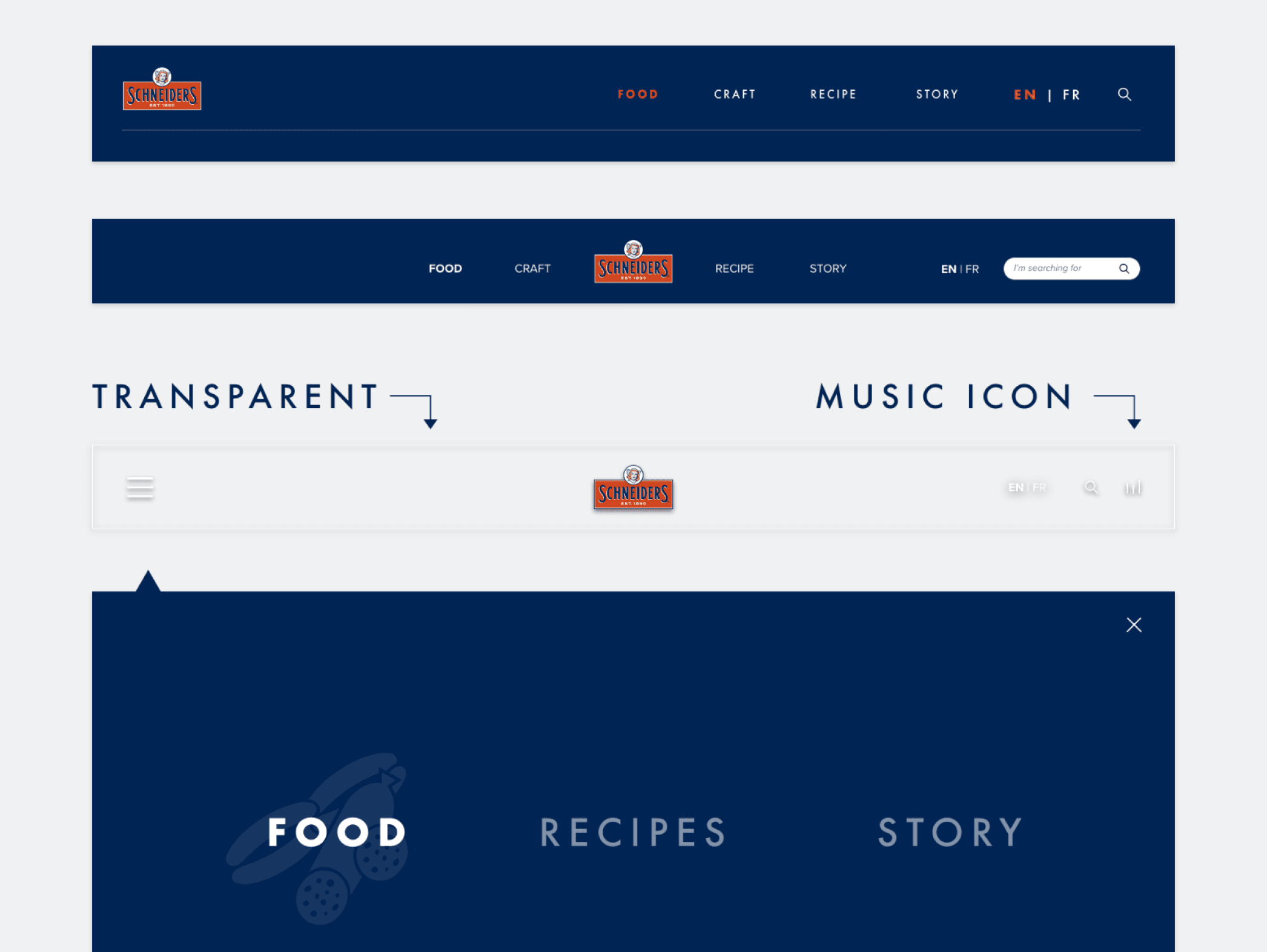
Enhancements to the user interface were crucial: a clean, straightforward navigation system for a smooth user experience. The goal was to transform the website into a sought-after resource where users are drawn back for its rich and relevant content.
The product vision
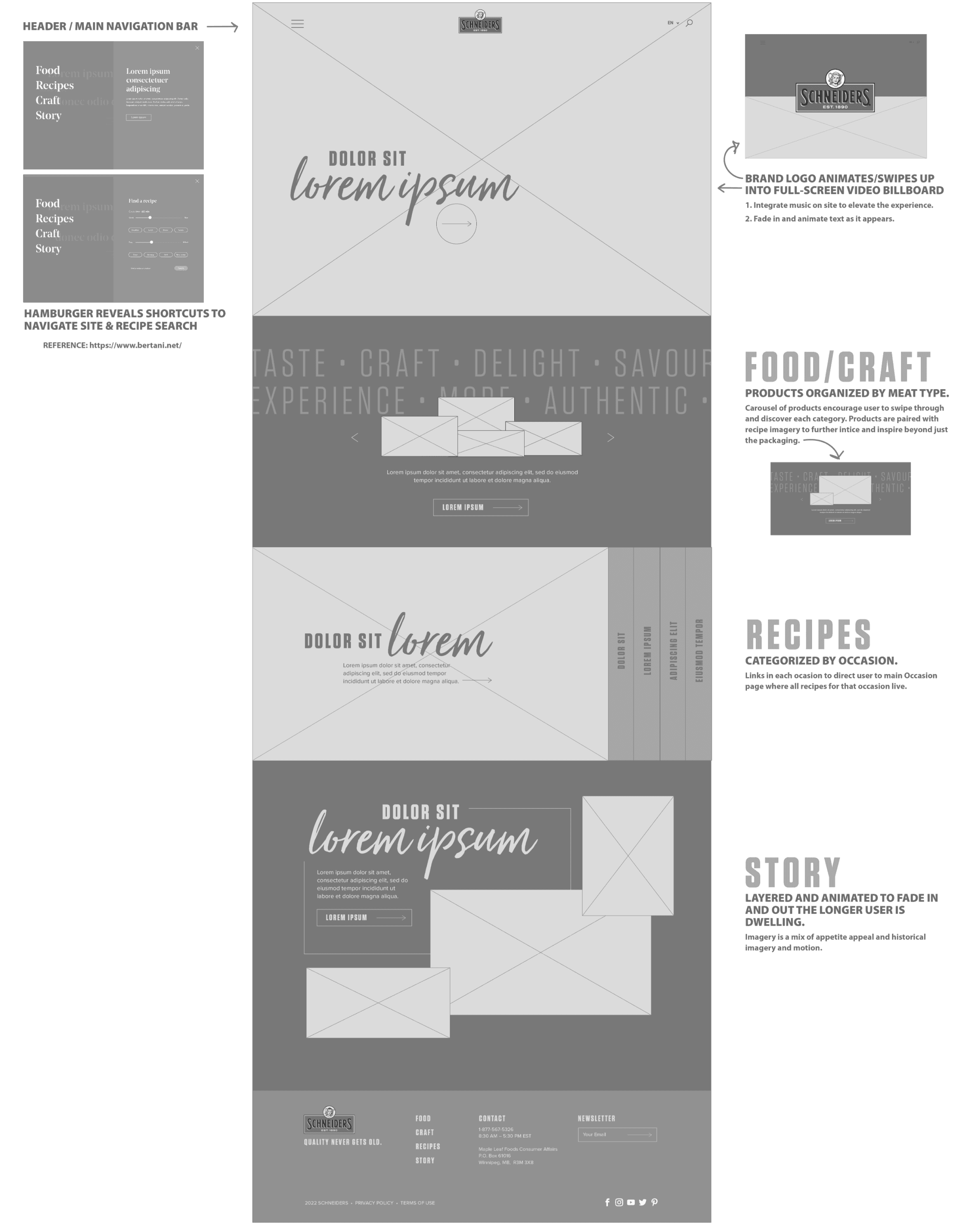
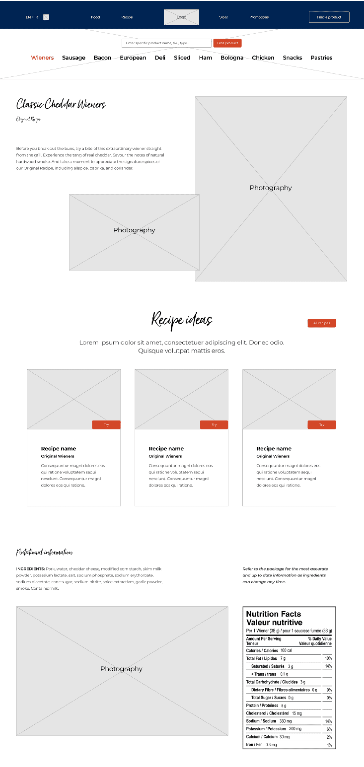
Recipes will be the central focus of the UX design, therefore, the design will emanate from the recipes, making them the heart of the user experience.
Focus 1
Continuity in Craftsmanship
I need to highlight that the products are crafted with an unmatched attention to quality. For many years, Schneiders maintain a consistent, brand-centric tone when referring to the products: "We still smoke our sausages the way JM Schneider did back in 1890, and we won't change that."
Focus 2
Consistency in “Our Story”
Schneiders history is marked by key milestones, along with moments of inspiration, innovation, and imagination. I should highlight the pivotal moments that contribute to the narrative of craftsmanship and ingenuity.
Focus 3
Emotive Connections & Savouring
"People may forget what you did, but they will never forget how you made them feel."
I want to engage the users by emotive language that speaks to the creation of quality meals from quality ingredients. And shows that Schneiders is poised to curate meal solutions for any occasion.
Solution
Objective 1:
Provide website visitors with a direct user experience to easily access the content they want
Objective 2:
Introduce site innovation to enhance user experience and embed Schneiders into the user’s routine consideration set
Objective 3:
Drive repeat visits & customized experiences based on behaviour – create enrichment of the experience
Objective 4:
Support brand equity & values:
Authenticity, Craft, Taste
Design Opportunities
Dynamic Video Integration: Infuse the interface with more motion to enhance visual appeal, creating an experience that transcends the feel of a template and becomes truly immersive. Incorporate footage from YouTube commercials and similar sources to achieve this effect.
Typographic Harmony: Utilize impactful headline fonts such as the elegant script of Just Lovely or the classic serif style of Noe Display. Complement these with clean sans serif body text using Tungsten Book or Proxima Nova Regular for readability and design balance.
Maximalist UI Approach: Craft a rich, maximalist user interface that offers a robust, layered, and sophisticated experience. Aim for a textured, captivating, and bold aesthetic that seizes and maintains user attention through a variety of visual elements that narrate a compelling story.
Revamping the Recipe Experience: Modernize the recipe section, which is currently perceived as outdated and unappetizing, to make it more engaging and visually enticing.
Content Curation: Streamline the textual content to avoid overwhelming users. Be selective about the amount of content displayed and its placement within the layout.
Selective Imagery: Choose imagery carefully to feature photography that exudes an elevated, contemporary feel rather than appearing dated or stale.
Lofi Wireframe
Components Choices

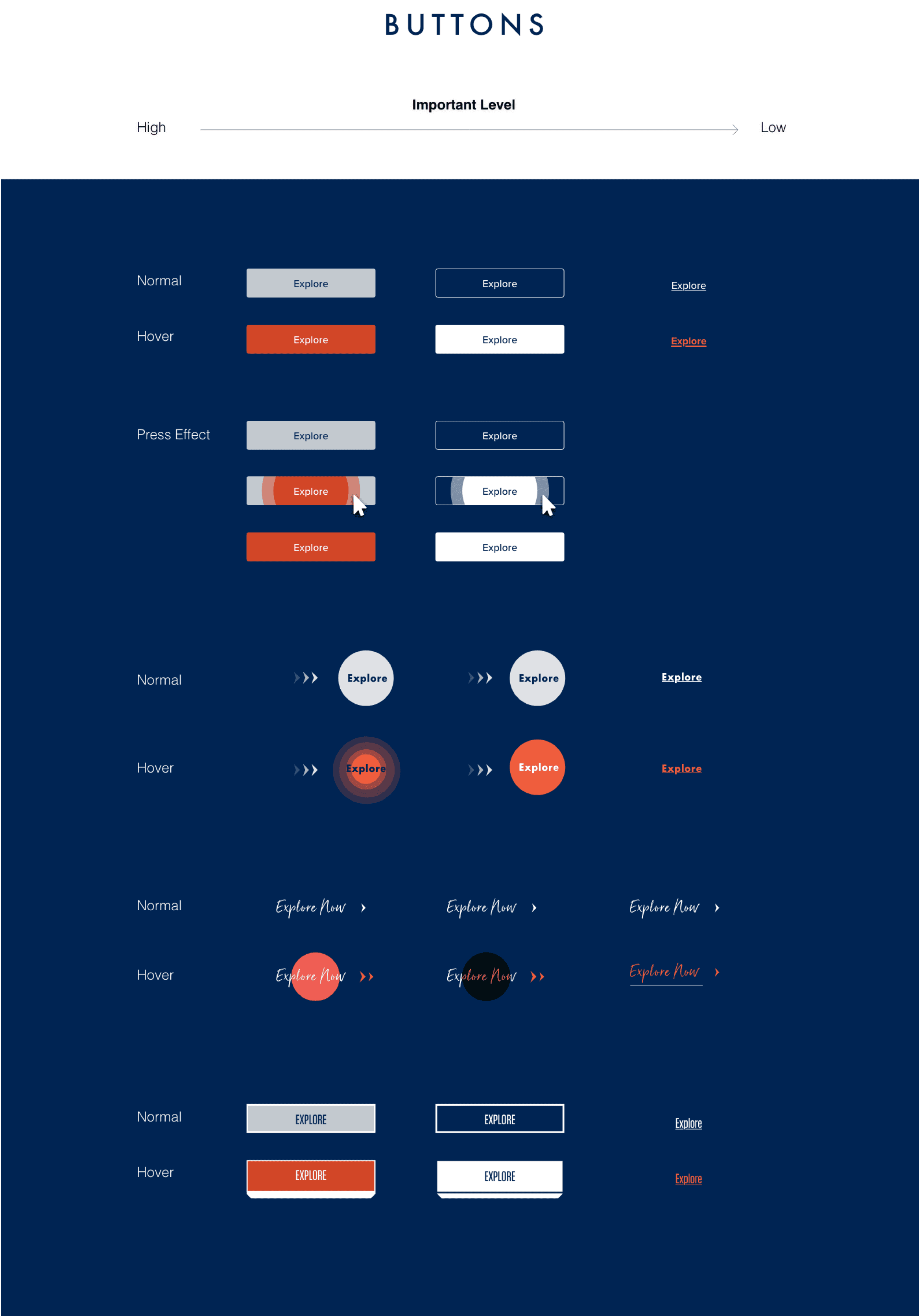
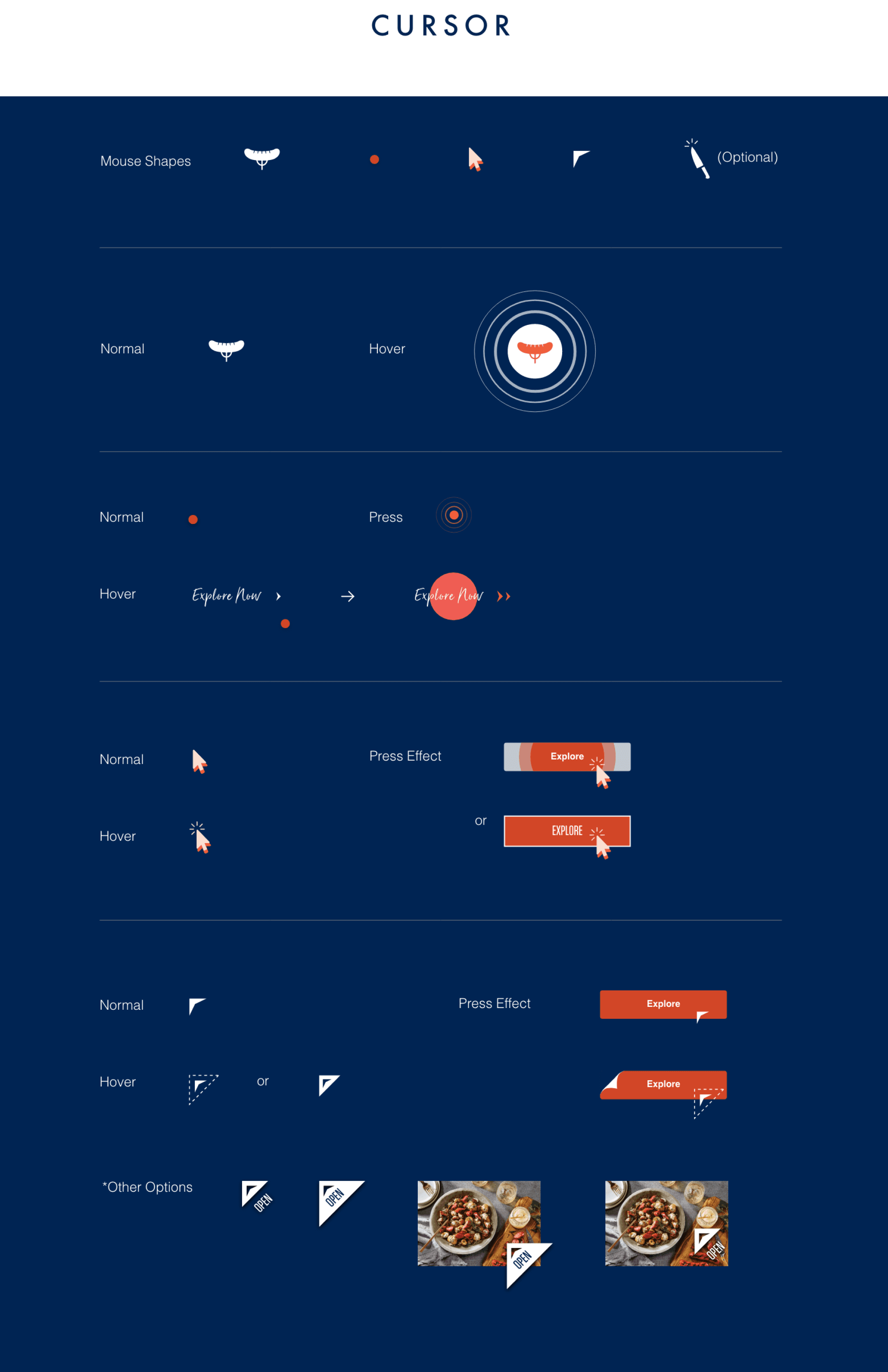


UI Guide
Reflection and takeaways
As someone who used to work as a graphic designer for 7 years, the Schneiders project reminded me of past experiences spent designing visually appealing elements, which I greatly enjoyed. Having been a loyal customer of Schneiders since childhood, I am extremely proud to have been part of the team that brought a fresh look to this century-old brand. There are several key takeaways:
Branding Consistency: The significance of maintaining brand consistency throughout the UI to reinforce Schneiders' identity and values, which can foster brand recognition and loyalty.
Maximalist vs. Minimalist Balance: Finding the balance in a maximalist design approach to ensure that while the site is visually rich and layered, it doesn't become overwhelming or detract from the user's ability to find information quickly.
